
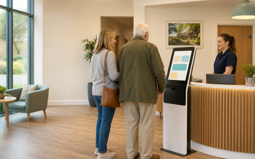
If you are looking at a self service kiosk healthcare UK setup, the question is rarely “can people tap a screen?” The real question is whether it will remove a frustrating step without making reception, privacy or accessibility harder. In a care home, clinic or community setting, a useful kiosk should give visitors a clear first action, give staff a dependable handover point and leave a sensible record of what happened.
Self service kiosk healthcare UK: start with the real visitor journey
A screen by the entrance is not automatically a better arrival experience. Begin with the moments that are already creating pressure: a visitor waiting to announce themselves, a relative arriving outside the busiest reception window, a patient checking in, or a team member repeatedly answering the same directional question. Write the current journey down from the visitor’s point of view. Then decide which single step a kiosk can genuinely improve.
For some organisations that first job is a simple arrival notification. For others it is wayfinding, booking confirmation, menu ordering in a care-home café, or taking a payment for a non-clinical service. A self-service kiosk planned around the actual journey is more useful than a large feature list, because the team knows what “working” looks like on day one.
What a healthcare kiosk should do — and what it should not try to do
A kiosk can make repeatable, low-risk steps easier to complete. It can welcome a visitor, present clear choices, collect only the information required for that purpose and route the result to the right colleague. It should not be treated as a substitute for a person when someone is distressed, confused, has a safeguarding concern or simply needs a conversation.
Good first uses
Start with a narrow, observable job: “I am here to visit”, “I have an appointment”, “I need directions”, or “I would like staff assistance”. This lets you test wording, placement and staff alerts before adding more. The same principle applies to First Essential One workflows: automation should make a handover clearer, not hide it.
Jobs that still need a human route
Build an obvious “speak to reception” option into every route. A visitor must not have to disclose sensitive detail to escape a dead end. In a care setting, the safest design is usually a short digital route followed by a visible human alternative. That also makes the experience more welcoming for people who do not want to use a screen.
Privacy comes before interface design
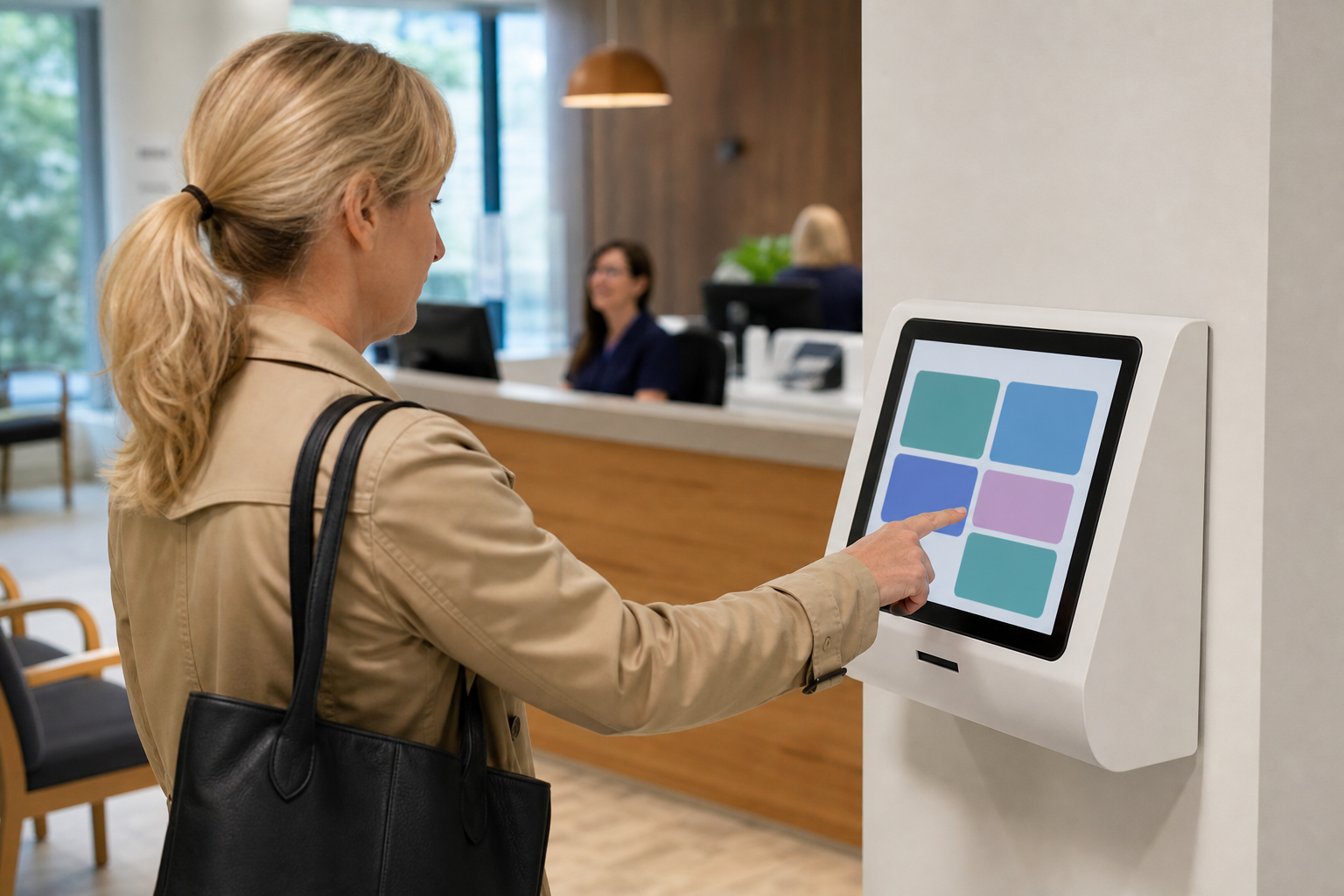
Healthcare and care settings can involve personal information, so the information journey matters as much as the physical device. Ask what the kiosk needs to collect, who can see it, where it goes, how long it is kept and what happens when the screen is left unattended. If a name, appointment or other personal detail is visible to the next person in the queue, the flow needs changing.
The ICO’s guidance on data-protection impact assessments is a practical starting point where a new process may create higher privacy risk. It is not a box-ticking exercise: use it to surface the moments where a kiosk could expose information or leave staff without a clear responsibility. For NHS organisations, the Data Security and Protection Toolkit is also a useful reference for the wider information-security conversation.
Keep the device out of sightlines where people queue, use a timeout that clears the session, and avoid asking for more than the immediate task needs. A self service kiosk healthcare UK project is much easier to defend when the team can explain why each data field is there.
Accessibility is a delivery requirement, not an extra
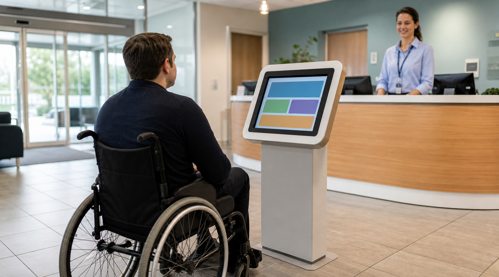
A kiosk that works only for a confident, standing, English-speaking visitor is not doing its job. Test it with people who use wheelchairs, walking aids, glasses, hearing aids or screen readers; people who have limited digital confidence; and people who need a carer or family member to help. Positioning, type size, colour contrast, reach range, plain wording and a non-digital route all affect whether the service is usable.
Public-sector bodies may have specific obligations under the accessibility requirements for public-sector websites and apps. Even where those rules do not apply directly, their direction is good operational practice: make the journey perceivable, understandable and possible to complete. Do not assume an icon is self-explanatory. Test it.
For a care home or private clinic, a short observation session is more valuable than an internal debate. Watch someone complete the task without coaching. If they pause, search or look for a member of staff, that is evidence for a design change.
Choose the right physical setup
The best self service kiosk healthcare UK layout supports the room rather than dominating it. A freestanding kiosk may suit a spacious reception. A counter-mounted screen may work better for a café or service desk. A wall unit can suit a corridor, but only if there is enough space to stop without blocking access. Consider privacy, glare, cleaning, power, connectivity and where a colleague can help without leaning over the visitor.
Use the same care when planning connected hardware. If the task includes orders or payments, decide whether it belongs on a dedicated kiosk route or at a staffed EPOS point of sale. A device included with an EPOS system should always be selected as part of the whole operating flow, not because it looks impressive in isolation.
Compare the three rollout choices
| Approach | Best for | Watch for |
|---|---|---|
| Visitor check-in only | A clear first test with low process change | Unclear staff alerts or private information on screen |
| Check-in plus service requests | Sites with repeatable questions and defined handovers | Too many options on the first screen |
| Order, pay and operational integration | Cafés, dining areas or retail-style services | Training, support ownership and payment journey design |
There is no prize for choosing the most complex option first. A small, dependable launch gives you real usage evidence. It also gives staff a chance to shape the scripts, notifications and exceptions before the process is relied upon.
Connect the kiosk to a clear staff handover
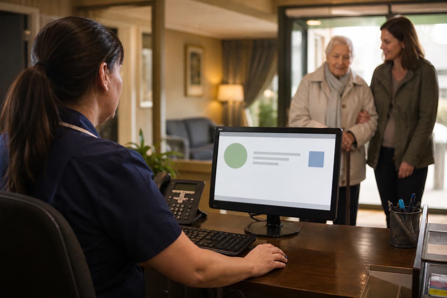
The visitor-facing screen is only half the system. Before launch, decide exactly who receives each alert, what they see, how quickly they should respond and what happens if they are unavailable. A reception alert that lands in an unmonitored inbox will create a worse experience than a queue at the desk.
Map the handovers in the same place you manage enquiries, appointments and follow-up. A connected AI assistant can help route routine requests, but it must make the human escalation point visible. This is particularly important where an arrival, question or request may have safeguarding implications.
Security and resilience deserve a practical plan
Ask the ordinary failure questions before launch. What does the kiosk show if the internet drops? Who can restart it? How are software updates handled? Who has administrative access? Where is the support contact? A quick paper fallback for visitor arrival or service requests is not a sign of failure; it is a sensible continuity measure.
The National Cyber Security Centre’s small-business guidance is a useful baseline for access control, updates, backups and staff awareness. Keep device access separate from everyday shared passwords. Record who owns the device, the account, the configuration and the supplier relationship so a change of staff does not become a loss of control.
Design language for a calm, respectful experience
Healthcare settings are often stressful places. Short, neutral language works better than clever wording. “Welcome. Please choose an option” is clearer than a long introduction. “Speak to reception” is better than “other enquiries”. Do not make people guess whether they are in the right place.
A self service kiosk healthcare UK interface should also avoid assuming why someone has arrived. Use broad choices and offer a clear human route. When a visitor has chosen an option, show what will happen next: “Reception has been notified” or “Please take a seat and a colleague will help you.” That one sentence reduces uncertainty.
How care homes, clinics and community services differ
Care homes
Visitor sign-in, infection-control prompts, dining or café ordering and clear staff notifications can all be practical uses. The tone must remain personal. Family visitors may be anxious or unfamiliar with the building, so the kiosk should complement a warm welcome rather than replace it.
Clinics
Appointment arrival and wayfinding may be useful, provided the privacy design is robust and there is an alternative for anyone who cannot use the screen. Do not present clinical advice through a general check-in route unless the service has formally designed, reviewed and supports it.
Community and wellbeing venues
These settings may benefit from simple booking, class arrival, payments or information journeys. The broader industries we serve approach is the same: let the site’s routine determine the technology, rather than making the routine fit the device.
Plan the first 30 days, not just launch day
Set three or four measures before go-live: the number of completed journeys, the number needing staff help, the average response time to an alert, and the most common exit point. Add qualitative feedback from visitors and staff. You are looking for friction, not merely volume.
Review the first week daily, then weekly. If the same question keeps reaching reception, improve the first screen. If staff routinely bypass an alert, fix the handover. If visitors avoid the kiosk, check placement and the greeting. A self service kiosk healthcare UK rollout becomes valuable when it keeps improving the real service rather than becoming furniture in the lobby.
Common mistakes to avoid
The most common mistake is trying to digitise every interaction at once. Others include placing the screen where confidential details are visible, using jargon, leaving no human alternative, treating a notification as a handover, and forgetting who will support the device after installation. None of these are technology problems; they are ownership problems.
Another mistake is buying before mapping the process. A short discovery session with reception, operations and the people who actually greet visitors will identify the useful first use case. If you need help turning that map into a workable setup, the First Essential UK team can talk through the operating flow before any decision is made.
Make the procurement decision with evidence
Before choosing a supplier, ask to see the exact visitor journey, not only a product demonstration. Check who configures the content, how changes are approved, whether the organisation can export its records and how support works when the screen is unavailable. A self service kiosk healthcare UK decision should include reception and operations colleagues, information governance and a person who understands the building and its visitors.
Use authoritative guidance to frame the questions. The CQC guidance for providers is a reminder that technology must support safe, person-centred care. The NHS guidance on online services can help teams think about support for digital routes. The GOV.UK inclusive communication guidance is useful reference reading.
Walk through the busiest ten minutes: who arrives, what they choose, what staff see and how exceptions are handled. Repeat it with an anxious visitor, a wheelchair user and an unavailable receptionist. These are the conditions that reveal whether a self service kiosk healthcare UK setup is workable.
Use a small governance checklist
Give one named person responsibility for live content, another for operational response and another for technical support. Record the device location, software account owner, privacy review date and fallback process. This makes the self service kiosk healthcare UK service maintainable. See our case studies for the value of mapping operating change.
For a final check of the information journey, use the GOV.UK data-protection overview. A self service kiosk healthcare UK rollout works best when staff, visitors and governance owners can each explain the purpose of every step.
Key takeaways
- Start with one repeatable visitor task, not a list of features.
- Build an obvious human route into every screen.
- Design privacy, accessibility and staff handovers before choosing hardware.
- Use a small launch, a documented fallback and a 30-day review cycle.
- Keep ownership of data, support and configuration clear from the outset.
Frequently asked questions about self service kiosk healthcare UK
Can a self service kiosk healthcare UK setup replace reception?
No. It can remove repeatable steps and improve routing, but reception remains essential for exceptions, reassurance and situations requiring human judgement.
What should a healthcare kiosk collect?
Only the information needed for the immediate task. Decide the purpose, access, retention and staff handover before asking for any personal information.
How do we make a kiosk accessible?
Test physical reach, contrast, text size, wording and the alternative route with real users. Keep staff help easy to request.
Can the kiosk take payments?
It can be designed for service or café-style transactions where appropriate. Plan it alongside the wider EPOS and support journey, not as a stand-alone add-on.
How long should a pilot run?
Allow enough time to see normal busy periods and exceptions. A 30-day review plan gives the team evidence to refine the flow.
Ready to plan a calmer arrival experience?
Tell us what visitors and staff currently find difficult. We will help you map a practical kiosk journey and the handovers behind it.